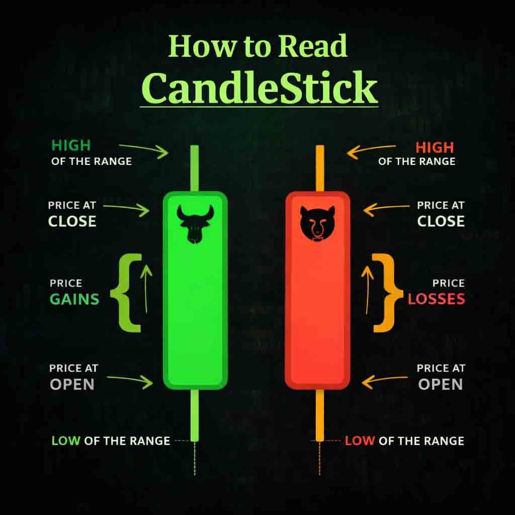
Candlestick charts display the price movement of a stock over a specific time period. Each candle shows four key prices: the open, close, high, and low
Bullish Candle
When the closing price is higher than the opening price, the candle is usually green or white, indicating buying strength.
Bearish Candle
When the closing price is lower than the opening price, the candle is usually red or black, indicating selling pressure.
The candle body represents the distance between the open and close, while the thin lines, called wicks, show the highest and lowest prices reached during that period. By analyzing candlesticks, traders can better understand market behavior and potential price direction.
Many successful investors do not personally analyze charts every day. Instead, they rely on full-time professional traders and reputable firms to manage technical trading on their behalf. These services often require large sums as entrance investments, but some communities offer access to serious traders with smaller capital by providing profitable trading signals.
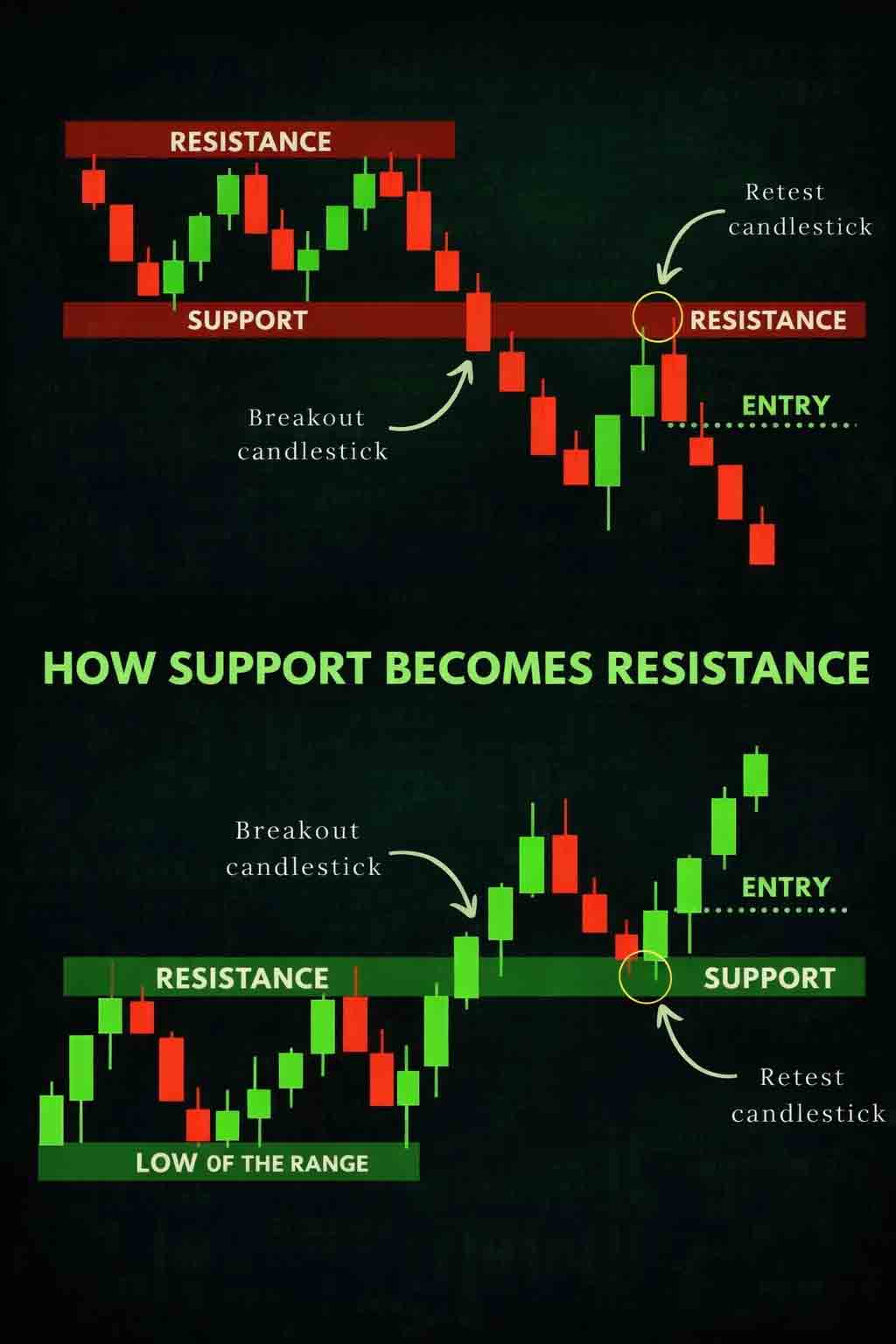
Support and Resistance Levels
Support
A price level where buying interest is strong enough to prevent the stock from falling further.
Resistance
A price level where selling pressure tis strong enough to prevent the stock from rising higher.
These levels help traders decide when to enter or exit trades and where to place stop-loss orders. When price breaks above resistance, it often becomes new support. When price breaks below support, it often becomes new resistance.
Unless you can spend 14 hours each day monitoring charts, it can be difficult to identify high-quality trade setups. This is why many investors join communities supported by full-time analysts who provide market insights and trade signals based on a team of professionals’ signals and price entry.
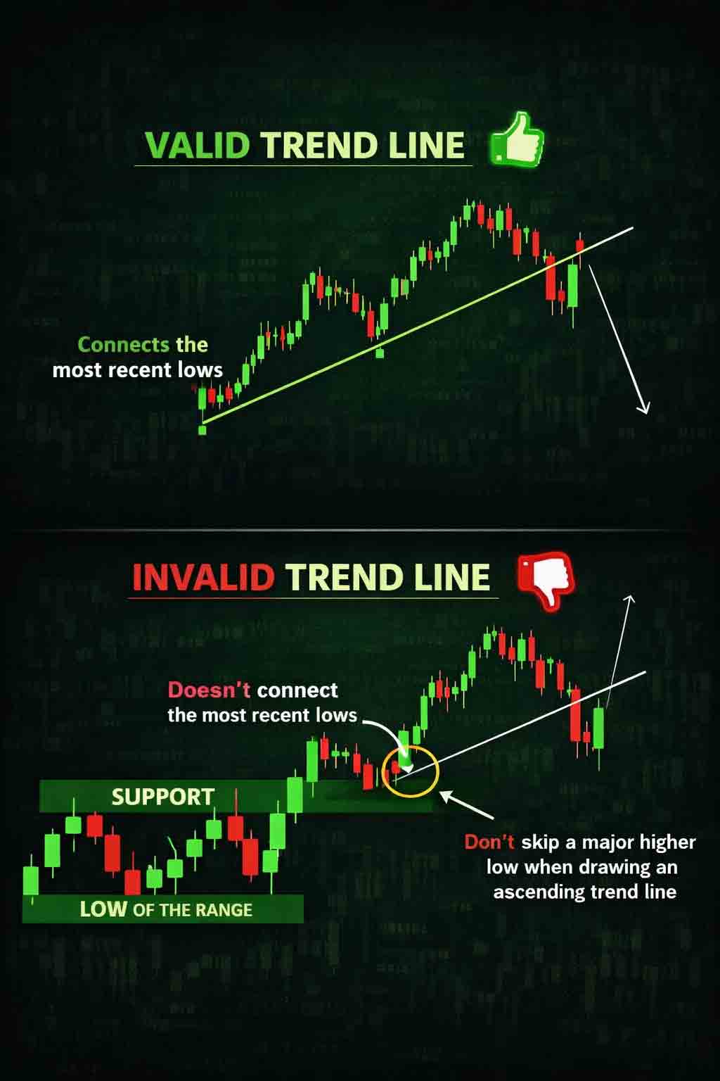
Trendlines and Chart Patterns
Trendlines are drawn by connecting higher lows in an uptrend or lower highs in a downtrend. They help identify the overall market direction.
Common chart patterns include triangles, flags, doubletops, double bottoms, and head-and-shoulders patterns. These formations often signal whether the price is likely to continue its trend or reverse.
Many trend traders manage large pools of capital from investment firms and family offices. Individual investors can benefit by connecting with professional trading communities that share the same strategies and trade ideas backed by institutional-level research and capital
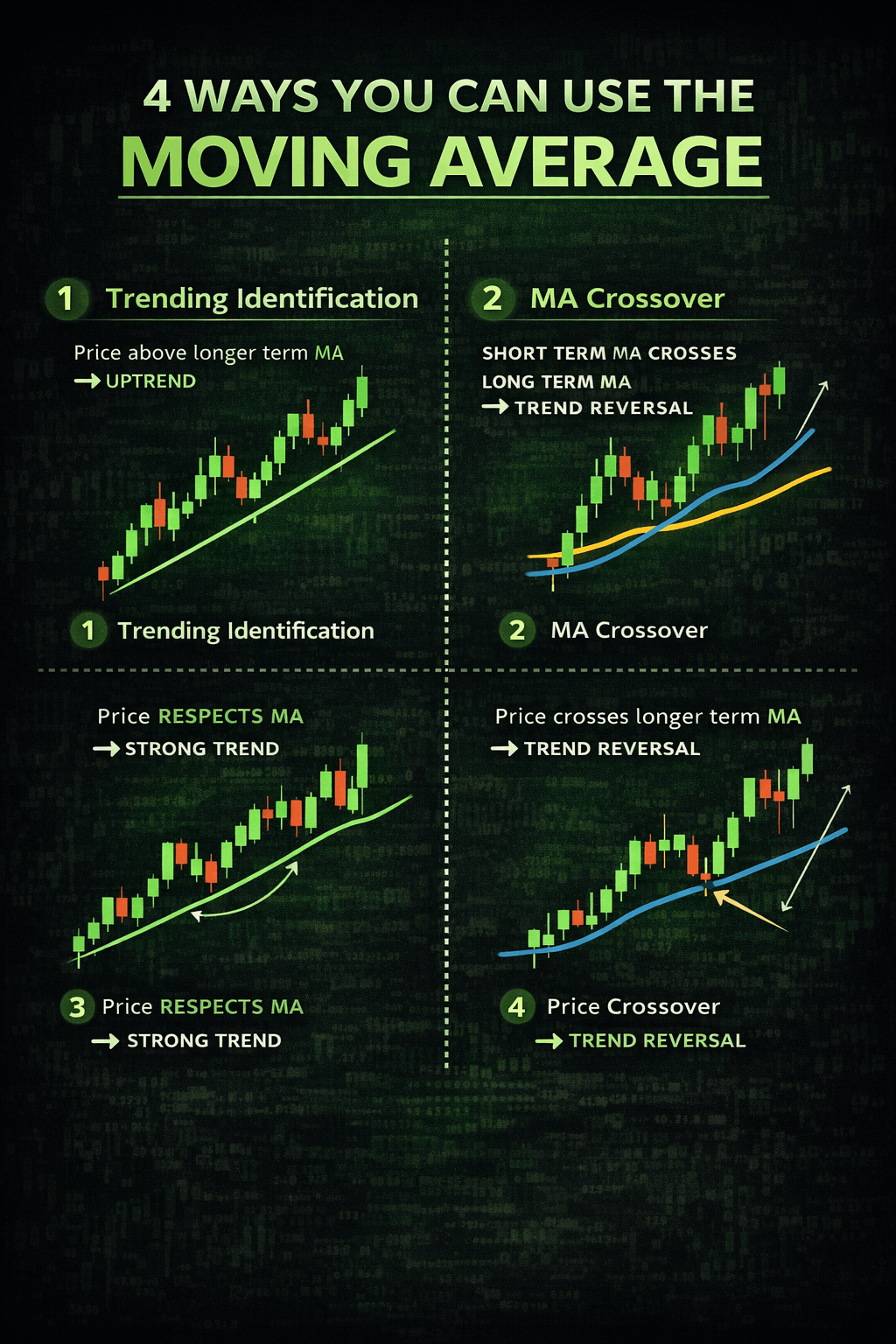
Moving Averages
Moving averages smooth price movements and help identify trends.
Simple Moving Average (SMA)
Calculates the average price over a set period. It gives equal weight to all prices in the range.
Exponential Moving Average (EMA)
Places more weight on recent prices and responds faster to market changes, making it more reactive to new data.
When the price is above a moving average, it suggests an uptrend. When the price is below, it suggests a downtrend.
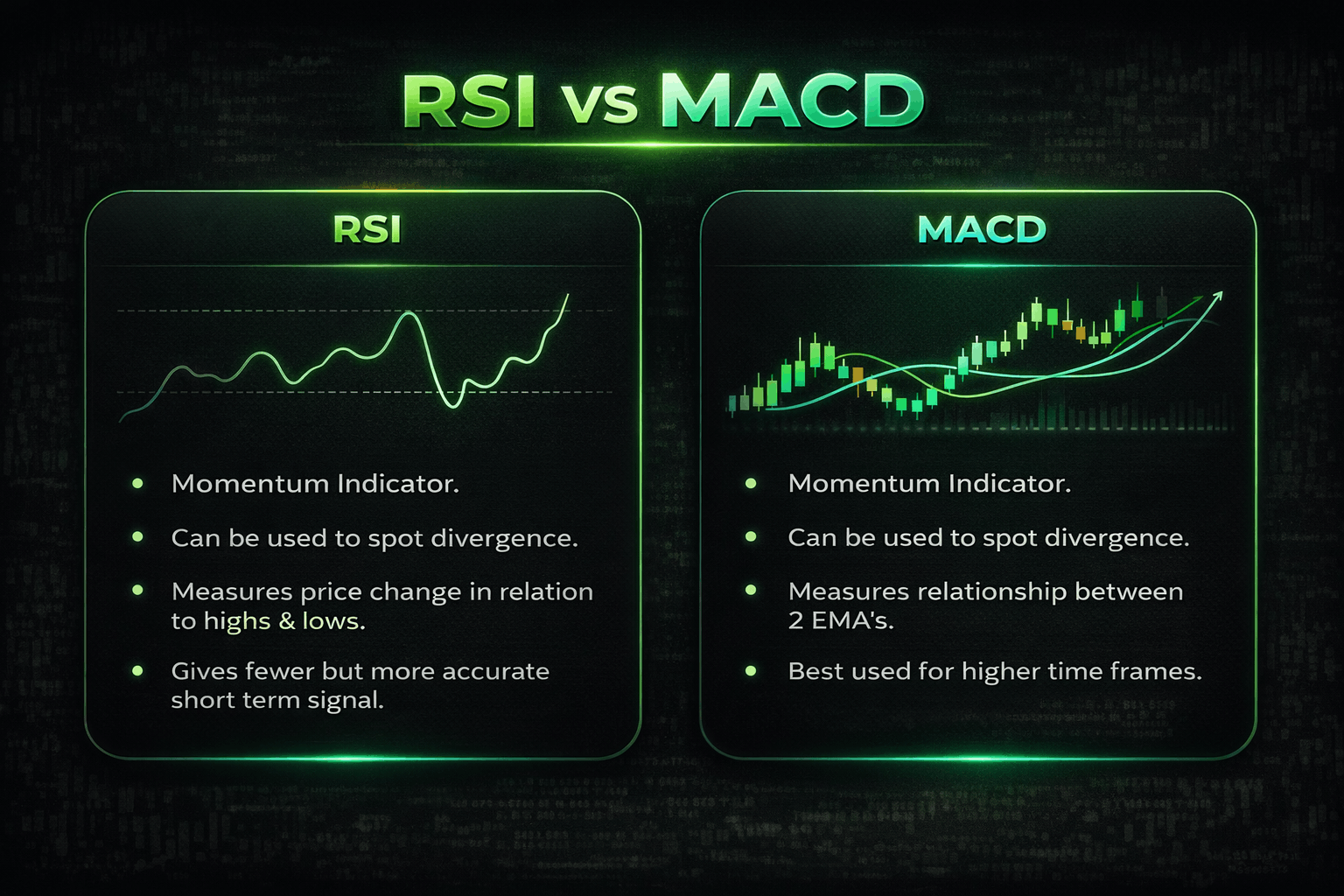
RSI, MACD, and Volume Indicators
RSI
Measures whether a stock is overbought or oversold. Above 70 may indicate overbought; below 30 may indicate oversold.
MACD
Shows the relationship between two moving averages and helps identify trend direction and momentum.
Volume
Represents the number of shares traded. High volume confirms strong market interest, while low volume may suggest weak price movement.
Final Summary
Technical trading requires time, experience, and daily market monitoring. While full-time traders dedicate years to mastering these skills, many retail and home-based investors choose to follow professional firms or experienced traders who analyze the market full time.
By trading the same signals from experts, investors can make more informed trading decisions and are more likely to succeed in the stock market.